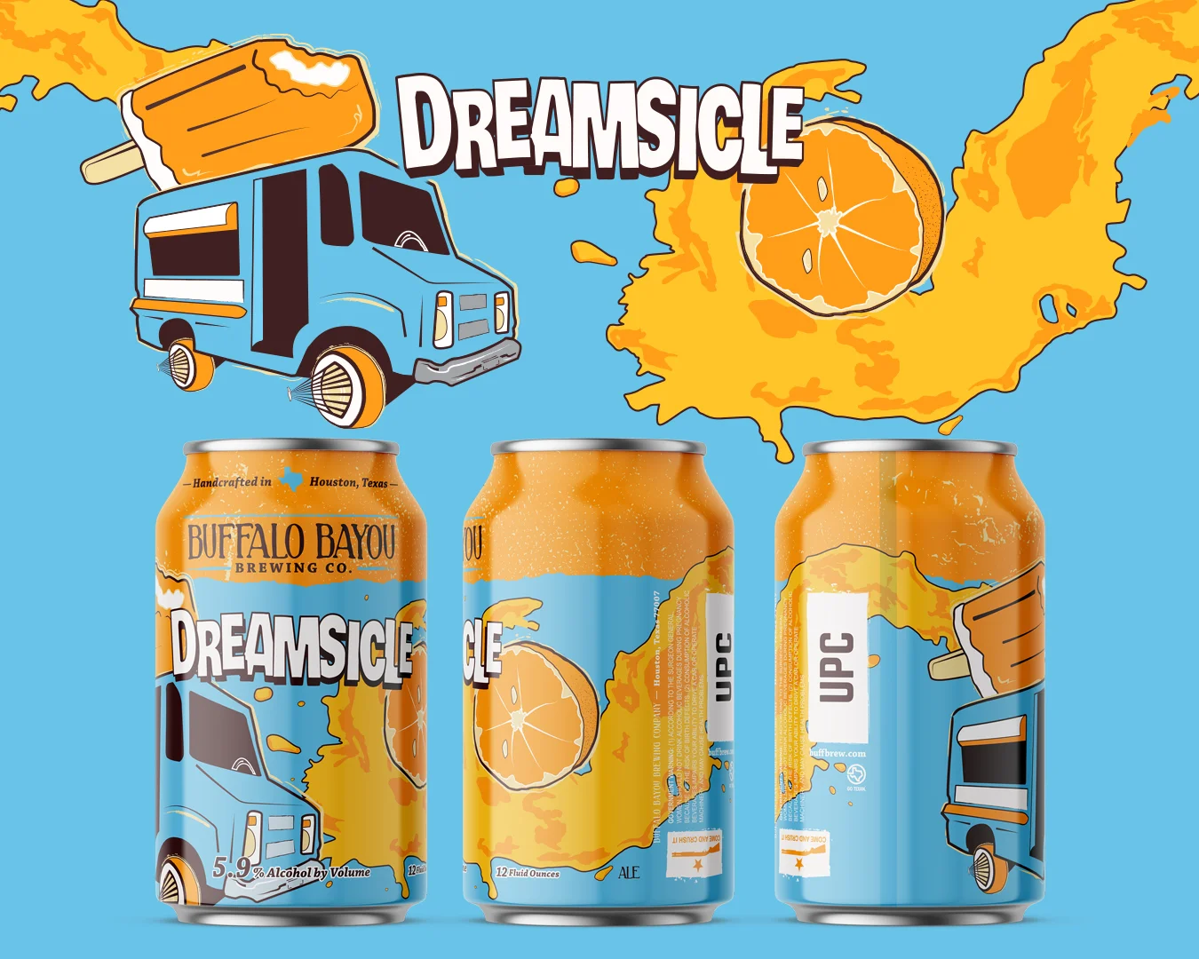
Goals for this design project were to inject new life into a core lineup of cans that hadn't changed in over a year; before the most recent can addition, it had been two years since a can was added. This label was to change the perception of the brewery, adding a sense of fun that would show that the company didn't take itself so seriously. From the start of this project, I worked without much input after defining the liquid itself and the target demo. By loosely playing with motion and then the elements that come to mind with the name "Dreamsicle", I dove head first into ways that could make this brand tie into Houston, as that's the one crucial element of the overall company brand that lives in each packaging design. Houston car culture is a nationally recognized thing, and stylizing the ice cream truck in a way that makes it a part of the culture would really create an attachment to both the target demo AND an increasingly wider audience. I wanted to make this a collector's piece in addition to an attention grabber, and it worked. Sales of this brand eclipsed numbers of any can launch to date for the company. 2000 cases sold in a week, 600 cases in the first 24 hours.
After presenting the sketches of different directions we could take working within the parameters provided at the projects start, the client wanted to take the iconic Lowrider Ice Cream truck and mesh it with the motion and energy of the milk splash sketch. The one audible that I had to work in was a negative reaction to anything “milky” or “creamy” as the beer does not fall into the more trendy milkshake IPA style. This beer is an approachable, wide appeal crusher that’s perfect by the pool, on the table beside the grill, or at the bar while you watch the game.