

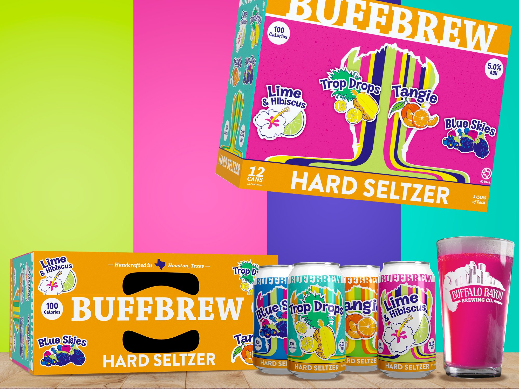
The goal of the Summer Street seltzer project was to introduce a new product vertical that stepped away from the established rustic and rugged Buffalo Bayou Brewing Co brand. It was actually the first product concepted and executed in the new building on new equipment. The unique thing about this seltzer is the vibrant colors of the individual liquids, as at that point hard seltzers were crystal clear without using natural ingredients. The volume package needed to stand apart from the usual seltzer aesthetic of white cans/labels and white packaging with subtle accent colors and photorealistic fruits. It needed to buck those trends while feeling right at home beside Best of The Best and IPA Party Pack boxes while evoking bubbly and electric energy.

The original art happened with a huge meeting of the minds. Developed by the brewery’s stakeholders as more of a finalized idea to tweak and make a reality from their sketches. Sometimes its an easy job that you have full control over, and sometimes you’ve got to meet them where they are and try to bring them home.

